- Lesson One: The Number One
- ... in Geometry
- ... in Nature
- ... in Culture
- "Uroboros" (related artwork by the author)
- "Creation" (related artwork by the author)
- Lesson Two: The Square Root of Two
- ... in Geometry
- ... in Nature, Part 1
- ... in Nature, Part 2
- ... in Culture, Part 1
- ... in Culture, Part 2
- "Duality" (related artwork by the author)
- Lesson Three: The Square Root of Three
- ... in Geometry
- ... in Nature
- ... in Culture
- "Vesica" (related artwork by the author)
- Lesson Four: Phi, or the Golden Proportion
- ... Intro, Part 2
- ... Intro, Part 3
- ... in Geometry
- ... in Nature
- ... in Nature, Part 2
- ... in Culture
- "The Flower of Phi" (related artwork by the author)
- Lesson Five: The Five Perfect Solids
- ... Intro, Part 2
- ... The Tetrahedron
- ... The Octahedron
- ... The Cube
- ... The Icosahedron
- ... The Dodecahedron

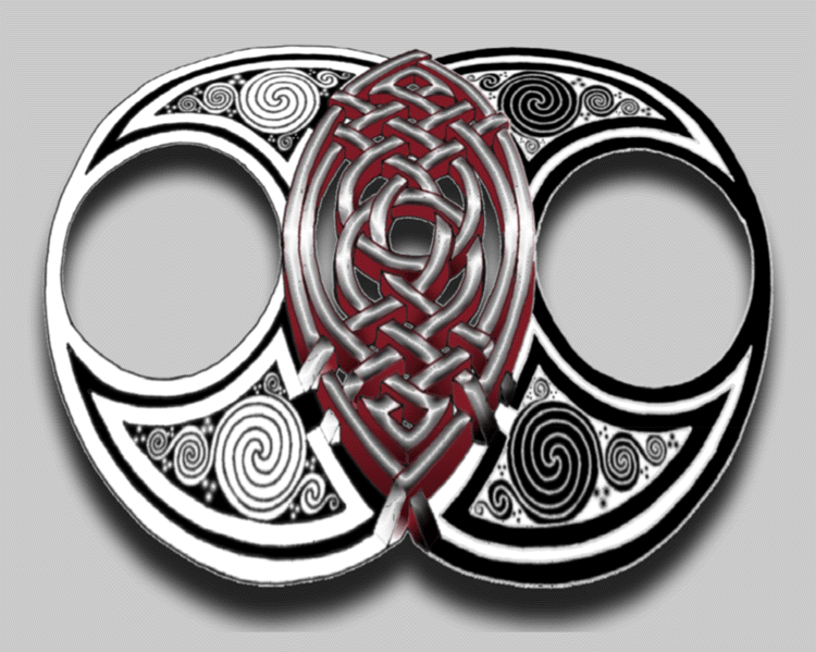
Vesica - A Related Artwork

AUTHOR'S NOTE, 1/2022: I created this artwork almost 25 years ago at the start of my career as a graphic designer. Visually the work has certainly not withstood the test of time and frankly is a bit embarassing to me personally, but I am including it regardless as I believe the associated notes can still assist the reader in understanding how one can interpret and utilize the principles of sacred geometry in the creation of visual artwork.
 Original artwork created by A. O'Connor for Nature's Word using Adobe Photoshop 5.0.
Clicking here will launch a new browser tab with a large version of the artwork. In this way, the observer may jump back and forth between text and image simply by clicking on the separate windows.
The symbolism of the piece:
The third piece, which I call "The Vesica," is representative of the geometric shape known as the Vesica Pisces, which carries within it the square root of three. As noted in my written work, it is representative of base creative power, and particularly the jump from two dimensions to three in geometry (as well as the universe). What we have here are two identical circles that overlap exactly half way through one another. The only effective difference between the two circles is that their colors are negative to one another (black on white becomes white on black). This is a very specific reference to the prior image ("Duality"), wherein the two halves represent the halves of duality. Each of our circles is meant to represent the very same idea, only here we find that in the oval shape that is generated by their overlap (this oval is the Vesica Pisces) something magical happens - the lines thath were strictly two dimensional suddenly become three dimensional bars. Also, color is suddenly introduced, and what might have been grey (the joining of black and white) is instead a shining, brilliant chrome.
Creative Process of the Piece:
The creation of "The Vesica" was far more complex than the other two pieces, easily taking between eight and ten hours, if not longer. The center weave was designed first in the hollow shape of the two conjoined spheres. Then the entire center weave was traced on to tracing paper and traced back onto the shape of the two spheres, but shifted approximately half an inch towards the top of the paper. This allowed for the adding of the depth, or "3D," to the sides of the central weave, giving it the appearance of being actual three dimensional lines. This then was scanned into the computer.
Next the spirals which fill each of the four crescent arms of the circles were drawn. This spiral pattern was drawn once by hand on paper. This was then scanned in, cleaned up, resized and reproduced three times (flipping vertically and horizontally) to fill the appropriate space in each of the crescent arms.
The red color was added, the "chrome" filter run on the surface of the center weave, and the "antimatter" filter run on the right hand crescent arms. Shading was added to the red sides of the weave to enhance the apparent shadows thrown by an unseen source of light, somewhere above the center of the image. Then the proportions of the top half of the image were shrunk vertically, gradually increasing shrinkage towards the top of the page, and the bottom half was stretched vertically, also increasing the amount of distortion towards the bottom of the page. This alteration of proportion creates the feeling that the image is laying down on approximately a 45 degree angle, as opposed to being completely parallel to the surface of the page. Finally a drop shadow was added to create the feeling of the entire object floating off of the page slightly.